The cerv.id Classic
All-In-One Jam Results (January 2025)
Awards
#Most Thematic Award Determined Collectively
Best Novice Award Determined by Eldog
You could hear it in my voice onstream— I was immediately doubtful that this was your first level. Even some chatters were stunned!
There are certainly rough edges, but the idea underneath shines through bright as hell!
Twins' said it best:
"My first map wasn't this cool!"
Best Technical Achievement Award Determined by JugadorXEI
Lua gimmicks are pretty hard to implement into levels— because of that, I'm very happy with how beastieballs were implemented, allowing for aggression that would otherwise not be possible.
It was very fun to play with the gimmick in both Race and Battle, which I think is a remarkable achievement on its own. Congratulations!
Chef's Kiss Award Determined by MrLogan
Usually for Mogi, we look to include maps that understand the basic "dos" and "donts" when it comes to map design. Maps that allow skill expression from individual players are also preferred, and I think you accomplished that really well here with the variety of lines that you can take here.
Keep up the good work, and congrats!
Raccoon's Choice Award Determined by Diggle
Mood can be tough to nail down in such a limited engine— This award goes to the coziest map!
The texture usage, music, custom decoration, and cute setpieces, combined with the time of day changes across the different gamemodes, all come together to a wonderful mixture of vibes that makes this map really feel alive. Incredible work!
List of Submissions
#(Ordered by submission date)
Eldog
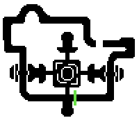
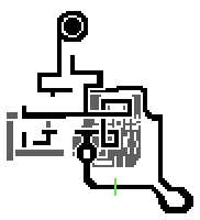
Remember to make your battle minimaps red guys :)
JugadorXEI
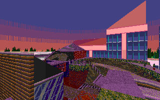
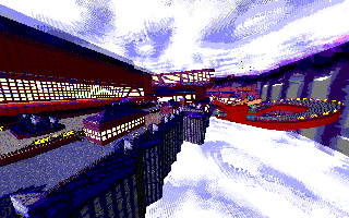
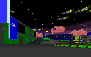
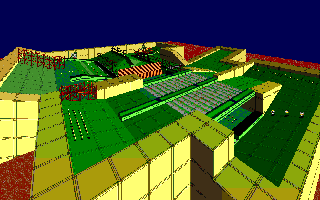
A pretty neat take on the "concert" level artpass, similar to 765 Stadium Zone, only that instead of using bright colors, it uses very dark colors instead.
The very high contrast between the road outlines and the background make it really easy to read on Race, with my only criticism being that the last turn can be rather blind due to the dark structure in the way obscuring the entrances onto the finish line. You can also bonk yourself between those entrances, which can kinda suck, so maybe a gray spring would help.
By far, my favourite highlight of this level is the Battle arena. I have a soft spot for wrestling rings, as I used to watch a lot of WWE when I was a kid… And being able to bounce yourself on the ropes is awesome. The very small capsule is also rather funny.

Eldog
This has the funniest gimmick ever. I can't wait to see it in netgames.
JugadorXEI
This level has a very interesting visual concept, with a pretty eye-catching thumbnail to boot.
I do personally think that the offroad killing players in the fire section is rather punishing - maybe stumble would be a better damage type to apply, to avoid the lightweight frustration of being bumped into death outside of their control. I do like the slightly slippery roads on the icy section, though, since it's not something I see often in levels.
The level is otherwise really simple layout-wise, but I hope you eventually add banked turns and bumpy, twisted roads into your skillset, since natural locations tend to be imperfect.
The battle arena is fine, and I like that you can see underneath the level better, it's something that could be visually explored a lot more if you wished.

Eldog
I think this is exactly the kind of map I expected to see (/pos) when I was thinking of the Jam's theme.
The visuals are deceptively pleasant, the thumbnail being drawn is a really cute touch, the colors breaking up the individual setpieces reads super well... Great work!
JugadorXEI
I legitimately didn't expect "Balloon Park Zone but for good, instead of for evil" in my hypothetical, made-up bingo card, but I am very pleasantly surprised at the result.
I am very happy at the very steep slopes, both upwards and downward - it really helps sell the rollercoaster vibe of the level. They provide high highs, and low lows, in the most literal sense of the word.
I also enjoy and appreciate that you can see amusement rides on the lower part of the level, and not only that, but that they also provide the battle arena as well. It's a cool type of foreshadowing that not a lot of other levels have (compared to others that either share or separate their layouts).
Eldog
I believe I mentioned it onstream, but I want to reiterate how much your mapping style lent itself to the Jam. The wide, sweeping turns in race giving focus to larger open areas in battle made this one of the most successful hybrid layouts, in my opinion.
JugadorXEI
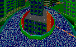
Using Lavender Shrine Zone's assets to make a daytime level is a pretty cool visual concept. I like that it seems to be in the middle of a festival as well, and the dragon as part of the road is pretty cool.
Layout-wise, it feels a tad easier than its inspiration, which is not a bad thing at all, it's quite a vibe to ride around the level.
The battle arena being a cordoned-off part of the level also allows players to appreciate its surroundings more, which is nice. It's quite large, which will help those servers that love hosting 16-player battle.

Eldog
I want to be upset about being subjected to a fucking teleporter maze, but it ultimately ended up being quite fun. The solution at the end would have fucking destroyed me if not for Diggle, as well.
Commenting on the rest of the stage before the gimmick is finished feels almost in poor taste, so I await the finished product eagerly!
JugadorXEI
Although the level's gimmick wasn't finished, I think the layout and visual style makes up for it quite a lot. It felt quite small, with very twisted and difficult turns here and there, but it's nice to have more technical layouts into the game.
The visual style evokes the hustle and bustle of the city nights quite well.
When the gimmick is finished, I'm expecting it to pop off in Battle, especially, and I'm looking forward to see how it'll look like.
Eldog
Something I didn't get to touch on during the stream— I love your use of differently scaled textures (an anchored skybox...?) to convey the relative scale of surfaces.
The split paths and resources hidden away in each corner have a very "DIY Racing Line" feel that I love in Ring Racers.
A very classic Achii map, meant in the best way!
JugadorXEI
It's visually very reminiscent of Darkvile Castle Zone 2, yet I appreciate how distinct it is right from the get go, with its split paths with varying rewards, variety in heights all throughout, and an awesome music selection. It's quite enjoyable to drive through.
The battle arena being a church that's right in the middle, with dead ends forcing fights, is also a cool way to make a battle layout work. The stained glass, and the acknowledgements to your previous levels as framed pictures, are also really nice touches.
Eldog
I love the flow of this map! I think you really nailed the tempo of the level, going from tight space to open space to tight space. It's obvious you have a good grasp on how resource management in this game works. Setpieces alternate between giving players moments to spend and gain resources.
The fact that you managed to only use vanilla textures is really impressive for how visually impressive the level is! I do think that, upon further reflection, some custom textures may benefit you. I think your color choices are what really sell the effect, but metal hull plating from Vermillion Rig doesn't necessarily belong on the interior of a mall. That isn't to say that you should replace all the vanilla textures, though! Custom textures can fill the little niches and nuances your level has.
In terms of battle, I think this map suffered heavily from being in the first few shown onstream, and didn't get its time in the sun. I love the upper level as a battle mode near-exclusive, and like how it makes just existing in the most central space more dangerous. Cool dynamic!
JugadorXEI
The perceived freeformness of the level is awesome, and the way it opens up in Battle is even better. It has a very striking visual style, since who wouldn't want to go up quarter-pipes in a mall? The only thing that is personally missing is a handful of ARK arrows to help with visibility and conveyance, but otherwise I think it's a cool level.
I hope you continue to keep making levels.
Eldog
I have to commend you for making a "Locale first, Layout second" type of layout. This was clearly a FOF nightmare to complete, and I was on standby during the whole ACS finish line fiasco. Thanks for powering through and submitting!
JugadorXEI
Is it a circle level? Maybe, kind of, not really? I was surprised at how much this level played with height differences, and how it provided different challenges, such as the surprisingly tight spectator area, and how difficult it can be to dodge items as you move up and down. The oasis at the end was a really cool sight as well.
And of course, Battle opening the level up in every direction helps a lot with its gameplay.
by AhemToday
JugadorXEI
This is the type of circuit design I like to call "horse racing", meaning having huge straightaways, that lead into lots of tethering, item play and instawhips. It's one of those level designs that are great, as long as it's done with moderation, but I definitely did enjoy my time racing here.
I did not expect the Battle equivalent to open up vertically so much, it felt pretty awesome, and a lot like playing a platformer level proper in Ring Racers, although I do worry about a Battle level being so open that it's hard to find people to fight, and the paper item spawns felt tough to find as well.
Eldog
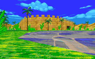
By reading this comment, you agree to the fact that Funky Fortress is cool.
JugadorXEI
Yup, it's an Udgey level— lots of sneaker panels, showy setpieces and technical bouts of gameplay all mashed into a really fast-paced package. Nothing to critique here.
However, I will say that, given you're a very experienced level designer, I wish you had gone a lot harder on the Battle layout as well, it's a little too simple compared to what you're capable of doing, and it would have been a great opportunity for you to show it off.
Nevertheless, the Battle arena is perfectly fine and presentable.
JugadorXEI
The beastieball gimmick is really cool and awesome, and I really enjoy that you put your Lua skills to the test while making your level. I had a lot of fun playing with it, and I hope you keep working on it after the collab. I think it has amazing potential, which is why I gave this level my Technical Achievement award. Congratulations!
And of course, Battle is where, in my opinion, the gimmick is fully realized. It's awesome to kill people with it. You really have something special here, great work.
Normally, I think that levels being a little flat can be to their detriment, but in this case it helps a lot setting up shots with the beastieballs, and hopefully some kills as well.
Eldog
lol
JugadorXEI
lol
...Okay, other than that...
I think there are some pretty interesting ideas layout-wise, that are interspaced with some other ideas that feel designed for the level creator to laugh at, while leaving the players to figure it out. I think the tightrope blocking lightsnake is particularly evil, for example.
I feel if you're going to design a level like this, it's a good idea to have ideas that allow you to laugh with the player, instead of at the player, or at least tell a joke that most can laugh at, but of course, humor is subjective.
60 capsules... Ooh man. And the Battle arena may be a little too big for its own good— I really do recommend cordoning part of it to use as the battle arena itself.

JugadorXEI
Honestly, this feels like a really hype level— going from waterfall to waterfall to access different parts of the circuit is pretty dope. Other than the boneless fence or two, it's a pretty neat layout as well, and I don't have a lot to say over the Battle arena, other than it'll be appreciated in small lobbies.
Keep up the good work.

JugadorXEI
It's a simple level, but the slopes are quite extreme, which I don't know what to think of. It can feel a little random whether you'll go off a slope or if you'll stay on the ground, which can feel quite wacky, although there's plenty of rings to mitigate such outcomes.
The battle arena is quite simple, perfect for 2-4 players. I personally wish there was something more to it, though.
Eldog
The custom textures in this map are super strong, and the color palette is really cohesive. Great work!
JugadorXEI
A chill drive all throughout - it's not an ambitious layout, but it doesn't need to be.
Other than the odd visibility and conveyance issues that were mentioned on stream (regarding the split paths and the upwards slope right angle turns, for example), I wish that there was risk-reward associated with the swinging maces, such as sneaker panels if you read those cycles correctly, I think that could be an interesting course element.
Other than that, I think the Battle version plays to the strengths of the level better, thanks to its verticality, only wishing that it was easier to get up the level using springs, for example.
I think this could a great level if you keep working on it post-collab, and I hope you do.
Eldog
I love the theme of your stage and the textures, though few, are very strong. I think something to break up the walls around your track would heighten the visuals a lot. Maybe an anchored skybox could sell the temple look?
JugadorXEI
The way the layout is structured reminds me of Kart v1 levels, with midtexture turns coating most of the course. It makes it feel nostalgic, in a way, and I really love the bright visuals all-throughout, as it helps sell that it's a structure in a floating island of sorts, or even just really high up.
It's a pretty close quarters layout, which is pretty neat. My only wish is for visibility to be improved, especially regarding that first item set obscuring the road, and maybe some ARK arrows here and there.
The way the Battle version removes all of the midtexture barriers is pretty cool, and feels pretty reminiscent of an SRB2 level.
Eldog
I love how natural the connecting paths feel. Slightly opening up some areas in battle is also a nice touch, and doesn't go unnoticed.
JugadorXEI
I'm not an F-Zero nerd, but from the two minutes I've researched, you have made your own version of a level that existed in F-Zero, and then put it into Ring Racers? That's pretty cool.
It felt pretty technical in various aspects, and it's a level layout I'd like to grind as soon as it comes out officially.
The paths that open up on Battle are a really nice way to make the layout work, I was surprised at how playable it was thanks to the paths that are added to it.
Eldog
I feel that we didn't touch on visuals much during the stream. I love the enormous waterfall wall, and I feel it could play into the level theme more. Where does that water go? Is it powering something? Can you see the flow? Asking yourself questions about your map can help you contextualize elements of it more strongly.
JugadorXEI
Oof, the visibility and conveyance issues in this layout were really rough, as well as it being easy to break thanks to using Sneakers on trick panels. I really really suggest using ARK arrows all around the level, and babyproof it by adding death planes and invisible walls so people can't cheese it so easily.
I did like how it opens up tremendously in Battle though, it made for a pretty nice arena.
Eldog
The fact that the spinner is true random is amazing. It instantly got my mind working. I almost wish while it was on cooldown it was a hazard and had collision...
JugadorXEI
Other than some easily-amendable visibility issues here and there, the vibes in the level are excellent, and the gimmick wraps the visuals up nicely. Of course, being a level made by Logan, the visual work was always going to be excellent to begin with.
I was actually pretty surprised at how well the base layout tends itself to Battle, it was a lot of fun to race around and check how it opens up in various different ways.

Eldog
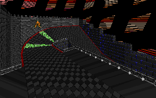
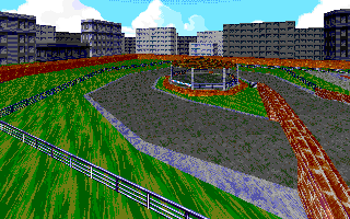
I love that there are lighting changes between different gamemodes, it feels so thematic! I think there is even more room to improve the lighting:
- The fairy lights could cast light in the evening or night.
- The bistro could have interior lighting.
- There could be lamps added to break up the relatively flat lighting of the park areas.
- Some of the glass building faces in-level and/or in the skybox could be partially lit (New Neocity did this very well in my opinion).
JugadorXEI
I'm a sucker for lighting changes in levels— lighting in general is an underlooked aspect in level design, as well as being a lot more difficult to pull off in an engine as old as Doom's, even with all the new belts and whistles, so I was quite pleasantly surprised at the inclusion of this level. Chaobrother's been around for a while, so I knew he could cook, but I was very happy to see that he's still at it strong.
Other than the odd visibility issue, and the lack of deathplanes (and the whole sunset thing I mentioned on stream— personal preference), I personally am a huge fan of it. The effort to make these types of things work doesn't go underappreciated, and if I could award my Technical Achievement award to another level, it would definitely be this one.
Oh, and the battle version is sweet.
JugadorXEI
There are not enough fully underwater levels in Ring Racers, so I'm happy with a circuit level that's fully underwater. I'm quite pleasantly surprised at how deceitfully simple the layout is, especially since a lot of base-game underwater levels and underwater sections tend to be quite technical, so I'm happy to get a safe space to practice underwater physics on (well, a "safe space" relatively speaking for this game).
Other than the performance issues, I don't have any major complaints. I still think it's very unusually kind to provide barriers on that one bridge when a player takes the related shortcut, but the nice thought is appreciated.
Oh, and come to think of it, is this the only Battle level so far that's also fully underwater? That's a pretty decent plus for uniqueness points alone.

Eldog
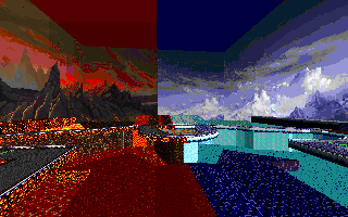
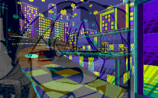
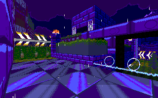
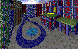
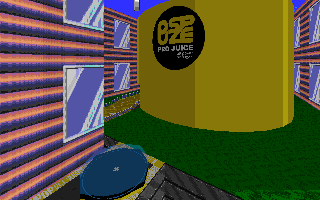
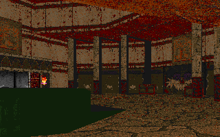
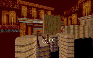
Another map with excellent visuals! The color palette being so dark but so saturated makes the indoor areas and brightly colored details pop extremely well.
The excitement in all the judges' voices was palpable as soon as it was pointed out that overtime takes place in front of fucking Waffle House. I hope that this map goes to overtime every match played in netgames, and I hope you get to savor all the reactions!
JugadorXEI
You get to duke it out at a Waffle House? Come on, now.
Jokes aside, it's a pretty fun level. There's some visibility issues here and there, but nothing unfixable, and the little areas around the city, such as the highway, underground tunnels, the mall/cinema(…?), the metro, and the little parking area/skateboard place tie it all together. Measuring the distances on the signs using fracunits was also a really funny touch.
And of course, it opens up nicely in Battle with new roads and places to go. Again, duking it out at a Waffle House is extremely funny and memorable, so you get 5 Juggy Points for that.
JugadorXEI
Ok, this was technically the last map of the stream and I was losing my mind, so I think I owe you a paragraph or two (or three (or four)).
I'm not familiar with the source material, but I think the level's presentation is pretty good, especially with the road decorations changing as the race progresses. The water-riding shortcut is also pretty cool-looking when you can pull it off. Other than some technical issues, like the gray hoops not appearing on one of the shortcuts, and one of the tripwires not working at all, I think it was a pretty fine level.
I am still not sure what the pit with the trick panels is supposed to be for, and why it shouldn't be shallower or not even a pit at all (or maybe even using different trick panels altogether), since it can potentially get people who fails a trick stuck, but I'll leave that as an exercise to the level creator.
I do like the playground vibe of the Battle version quite a bit, and I wish I could've played around with it more. Maybe in netgames?
Eldog
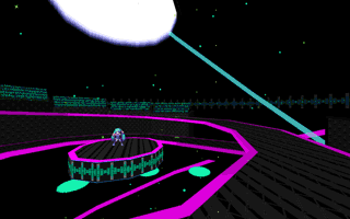
I stand by what I said onstream about the center emblem opening up during overtime into a pit of despair.
Also, my sincere apologies for the slip-up with the order of levels onstream.
JugadorXEI
[20 meters away from my computer, yelling from the top of my lungs:] Mortal Kombat!
Honestly, now that I think about it, it makes too much sense. A Mortal Kombat level is perfect for both Race and Battle.
The Race layout is quite fun, the quality and how steep the slopes feel feels quite reminiscent of vanilla levels, which is a huge plus for me— it always feels really good to go down slopes in this game, and that's a quality that's very present here. I hope you are able to sort out the bot issues, though!
And of course, the Battle arena, while simplistic… come on, it's Mortal Kombat. I honestly just think the premise alone carries the level, and that isn't a bad thing.

JugadorXEI
Gazebo fighting arena for gazebo lovers only. (Word 2010 registers that entire sentence as a typo, for the record.)
It's a very simple layout, so I don't have a lot to say other than maybe what I said on stream, but I don't think simple is a bad thing in this game— Ring Racers tends itself very well to a lot of different types of level designs, and it doesn't feel any different here. Just be mindful of empty/rewardless corners and you should be good to go!
And I do like that, of course, Battle opens the level up significantly, that's always fun.
Eldog
This is an insanely ambitious map to make for a self-proclaimed novice. I respect the immense effort this must have taken, even if it was criticized a lot. Thank you so much for participating! I also love the dash ring gimmick in battle.
JugadorXEI
There is a lot of level packed in, so there's a lot to say here.
Overall, at least for Race, I wish conveyance and visibility was better, especially with regards to alternate paths and visibility on the paths themselves. I think so, because the paths themselves are really cool, and there's a lot of really cool ideas packed in, so I feel that, with some proper TLC, you could have a proper classic in the making here.
I do think that the Battle arena may be a little too big, even for 16 players, so it may be a good idea to cordon off various other parts of the level to keep everyone close. Nevertheless, I do like the playground vibes of it quite a bit.
Eldog
The baked lighting in this level is peak. It's such a strong stylistic choice. Love it.
JugadorXEI
I don't feel we gave this level a proper shot because of all the issues related to the item boxes, specifically related to Capsules and Battle (I was farming emeralds for hours), but from what I saw in Race, it was a quite pleasant drive, and crushes are always a funny course element.
Other than some visibility issues mentioned, I found it quite fun.
And it's also quite funny how the whole level darkens up in Overtime. Hopefully the next time I try the level out, paper item spawns are fixed and we can have a proper bout.
Eldog
While I'm not necessarily an expert on Helldivers, the actual "diving" part doesn't really read to me. Don't you normally drop from space?
I may suggest looking at the "Change Skybox" action, and constructing an alternate skybox that shows the planet from space, or the town from above, or something to sell the effect a bit more. In that regard, you would know better than me.
JugadorXEI
Okay, the intro is pretty cool.
There's a lot of cool stuff in this level, like the "weapon caches" (item capsules) and the containers you can open up to find some extra goodies in, as well as alternate paths. I'm not familiar with the source IP, but I like the ideas presented here.
I do think the Battle arena may be a little too big, so cordoning that a little bit more may be for the best, but I also did appreciate having a lot of room to run around.
It felt a little lacking in blue spheres in Battle, and there's the visibility issue here and there, but those are easy to fix, and I hope they are looked into.
Eldog
What you said about already wanting to redo the level I completely understand. However, as someone with experience, I feel that there is still something here. Everyone is their own worst critic, and while I personally don't understand, some people love my "Classic" maps.
I suspect this is the same for you. While you may not have the best map in the entire world, there are sure to be people who still enjoy it. Thank you for submitting despite your feelings!
JugadorXEI
I will mirror what was said on stream: give yourself a little more credit! I think the Race layout is pretty cool, and there are some pretty cool ideas here that could even be expanded upon if you wished. I am personally a fan of the huge staircase spiral.
The Battle arena did feel a little empty, but all that's really missing is adding some more blue spheres here and there, and more reasons to go around the level.
If you do end up remaking the level, however, I will be looking forward to it as well.
JugadorXEI
It's always nice seeing vanilla assets used under a different context, this time being a more closed-quarters level.
I will mirror what was said on stream— some roads do need to be a little wider, and visibility needs to be improved just a touch. But overall, I do like what it tries to do, and I do enjoy the custom sneaker panel texture, for one.
And of course, I'm a fan of how it opens up in Battle as well.
JugadorXEI
Yup, it's an ArcadeStriker level.
I don't know how you do it, really— making deceitfully simple-looking, yet technical levels, that always makes you keep pushing for more. I felt like a fool when I ignored the gray springs on that one setpiece, thinking they were just for recovery, only for Eldog to find a really cool line out of them.
And I do like how open the Battle arena is, you can see anyone from anywhere— I'm personally hoping that enables some insane snipes in proper battles.
by Hexingale
JugadorXEI
You cooked with the storytelling of this level.
While I have no major objections with the Race layout other than visibility and conveyance concerns, the Battle arena needs some special consideration— 70+ capsules is a lot, and Battle should specially encourage people to hit each other, something that an enormous level can't accommodate appropriately. You may want to cordon off a lot of your level to achieve this.
Other than that, I really love your ambition on making an enormous level, so I hope you earnestly continue to keep making them.
JugadorXEI
The sky texture changes throughout the different parts of the level is awesome, and I enjoyed how fast-paced it felt with all of the straightaways, sneaker panels and downwards slopes, allowing for easy tethering and speed.
I do think the Battle layout is a little simplistic, but sometimes, simple is good.

JugadorXEI
The pace of the level is breakneck as hell, and the capsules spread all throughout makes it feel a warzone sometimes, if just for the sheer potential alone (people will go for the SPB), but I also can't help but think it's a little goofy as well, which isn't bad either.
I like the setpiece with the springs and the sneaker panels near the end, allowing for some interesting ways to gain speed throughout the level.
And the Battle arena is pretty tight, there was a lot of fighting, which was fun.
While the theme of a jam is largely a suggestion to get your creativity flowing, this map used the theme to its benefit and didn't just work around it, but truly embodied it.
Congrats, your map encompasses the spirit of "All-In-One"!